

Think of your scientific research conference poster as a networking and communication tool, and not a document or summary. If you can do this, you’ve taken a huge first step in making your scientific research poster a magnet for attendees. And you’ll draw envious glares from the presenters on your left and right.
At scientific and research-related conferences, poster presentations are:
- Your visual backdrop and a compelling statement of your research
- A conversation starter
- Your chance to get attention!
If done well, your poster presentation can:
- Help you make valuable professional and personal connections
- Quickly and compellingly communicate why your work is important
- Set you apart from the crowd!
If your poster’s done poorly, it can achieve nothing. You need to them to stop and take notice, connect with you, not… walk on by.
Make your poster presentation pop. Sizes, fonts, style, tone, tools, and examples follow.
What you’ll learn in this post
• Where scientific posters are used, and why.
• The objective and what to keep in mind when planning and making a scientific research poster.
• How researchers can more effectively use poster presentations to both inform and connect.
• What to put on a scientific poster and what software tools will make it pop.
• Common poster mistakes (especially for ESL/EFL English users) and how to avoid them.
• Specific examples of attractive, effective, and modern posters.
What is a poster session and a poster presentation?
Academic conferences have presentation where people stand behind lecterns and talk about their work. And they have networking sessions, which are commonly called poster sessions.
If you’re a researcher, you’ve likely been there: halls and lobbies full of boards arranged in rows onto which researchers pin their posters – graphical, pictorial summaries of their work. These are chances to promote your work to colleagues and even to the prestigious attendees.
There may be food involved, too. So, in a poster session, people may be walking around with a drink in one hand and a stack of pamphlets and papers in the other.
What do you do at a poster session?
You stand by your poster, for one. And you walk around and look at other posters as you network. Guests also walk around among the posters, stopping to talk with attendees along the way.
Apart from your stage presentation, if you had one, this is your chance for your work to capture interest.
As a researcher, you’re probably not used being a salesperson. You may also be scared to death of speaking with strangers, especially VIP scientists.
That’s OK, you have your poster to do some of the work for you. It’s your key that unlocks engagement.

What’s the goal of a poster?
A poster’s goal is to get the attention of passersby at scientific conferences. It’s a big paper board and a networking tool.
Simply put, a presentation poster is a graphical representation of your recent work – an article or a work in progress, or even a proposal. Printed on a big board.
More than that, it’s an engagement tool. To get people to stop, look, and engage, the poster should be treated like a presentation slide, rather than a document.
A good poster is attractive, clear, and when it gets interest, its mission is accomplished.
When people stop, you can approach them, because you’re the researcher. You can start dialog and connect. The poster is what made this happen.
What a poster is NOT
We edit many posters at Edanz. We fix up the English to a high level, of course. But frankly, many of these research posters are rather dull, even when they are presenting interesting science that people will want to discuss. The authors only see them as super-sized abstracts with a figure or two added.
Often they squeeze in too many words and lots of numbers and data. Many of these posters are have problems with formatting, making them hard to read and understand.
A conference poster is not a place to present all your data and give deep analysis. It doesn’t need every single detail of your latest article.
It does, however, need a logical structure and some visual appeal.
A poster is not to communicate every detail of your research, but rather to attract people’s attention and start conversation. Keep that in mind as you prepare it.
So then, what do you put on a research poster and how do you make it?
What goes on a poster for a poster presentation?
The overall structure and flow of a poster presentation is much like a research paper.
Key elements of a poster
As the late Paul Arden, a renowned creative director, said:
“The more strikingly visual your presentation is, the more people will remember it. And, more importantly, they will remember you.”
It’s true of ads and it’s true of scientific posters. Your poster should contain text and visuals. How you use them will determine its success.
Text in a poster
A poster typically includes the following text:
- Title of your work
- Authors and affiliations
- Introduction/background
- (optional) Questions/knowledge gap
- Materials, Materials and methods, or Patients
- Results
- Conclusions
- References for proper attribution
- Acknowledgements
As with a manuscript, and what our professional editors always recommend, much of the same applies for a poster presentation.
The key difference is that you don’t have to strictly adhere to grammatical rules. A few sentence fragments are fine. Bullet points are recommended.
But you still have to keep it academic. No slang or emojis, yo. ?
As for length, 300–800 words as a general rule. Any more than that and your font will probably become too small to read or there will be too much text jammed into your sections.
Despite the consensus being on around 300–800, some argue for even as low as 100–150, on the grounds that very few people actually read posters word for word anyway. If you have one solid main point, you might try this approach, and instead let your images and formatting do the main communicating.
Do your best to:
- Keep your wording as short and “plain” (understandable to a wide audience) as possible.
- Use the active voice (“We found…”) not the passive voice (…was found by…).
- Use language suitable for your audience; meaning you can use specialized terminology if they’ll understand it.
- Use ordered lists when possible – bullets (like this list) and numbers.
- Spell out any uncommon acronyms the first time you use them, unless they’re very common (such as HIV-AIDS or NGO).
We’d be happy to assign a pro editor to help you with this.
Visual elements of a poster
You accompany the text with visuals. Please use visuals. An all-text poster is no better than printing out your abstract in jumbo size.
Would a full-text billboard get your attention? Unlikely. It’s an eyesore. The same is true of a full-text or 95% text poster.
A couple of useful questions as you start
These will help you decide what to put In and in what format:
- What’s the most important finding that I want to communicate? (More than 1 is OK, but try to limit it.)
- How can I visually share my research with the conference attendees (e.g., charts, graphs, photos, diagrams… holograms!)?
Layout and visually effective posters
After you’ve decided what you’ll put in your poster (text and images), you need to plan your layout.
Sketch it out
It’s good to start with a sketch. You can simply do this by hand, in your Apple Notes or Google Keep, or in any number of increasingly available SaaS and local software packages.
If you’re confident, you can also just dive into your main software (see below). Whatever works best for you. If you’re collaborating with colleagues, a cloud-based platform will let you work collectively and from a distance.
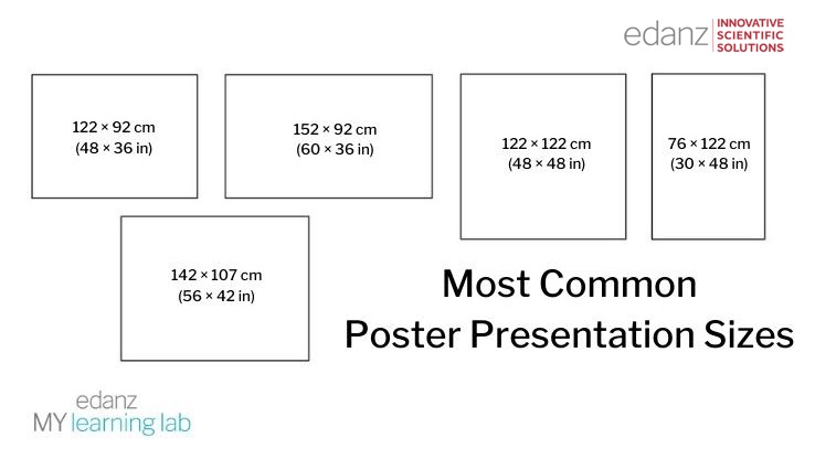
Horizontal or vertical
Most poster presentations are horizontal, but it’s not a rule. If your conference doesn’t have specific guidelines, these are the most common sizes.
Make it flow logically
English is read left to right and top to bottom. So the text should follow that flow as well.
Normally, your title and the authors and affiliations will go at the top of your presentation poster. Then use headings (H2, H3, H4, etc. if you’re using Word Styles/HTML) to break it up. Those headings will simply be the abstract-type structure listed above. But you can add specific subheadings to them.
It’s not a journal submission, so you can make the rules, unless the conference has provided a template and/or specific guidelines.
Columns, alignment, spacing
Typically, a scientific conference poster will have 2–4 columns. These should be aligned, though it’s OK if visuals cross over multiple columns. Try to keep the text as aligned as possible though.
Left justification is generally easier to read, while headings may look better if they’re centered.
Leave white space between subsections and around images.

Those examples show quite a lot of text. That may or may not be necessary for you. You can also view these as slides or blocks. Using that approach you can make each section a slide in PowerPoint or Google Slides, and then paste them together to form your poster.
Here’s another take on structure, with a couple of vertical options:

The above two are rather conventional choices, and you can’t go wrong with them. But this is the 21st century and if there are no guidelines, you can be even braver. You can, dare we say, disrupt. Keep reading.
Colors and fonts
Your background should be plain white or a very subtle gradient that’s not distracting. Your text should be clear and easy to read. Any charts or graphics should be understood quickly and not include any unnecessary elements.
The standard fonts for English text are Arial and Times New Roman. Fonts are not something to toy with on your research poster. Other safe options are:
- Calibri
- Cambria
- Georgia
- Helvetica
- And if you insist on being a bit unique with your font, Lato, Noto Sans, Poppins, and Merriweather will set you apart but maintain a mature look.
Avoid using Century font, as it seems to be the default on MS Word in Japan and possible other Asian countries. We’re not sure why, but it’s a rather clumsy and “uncool” font. Just use one of the above suggestions.
And finally, resist the urge to be cute and funny. That means absolutely do not use Comic Sans, a script font, or anything decorative. You might get a chuckle from a few viewers, but 90% will not be impressed. Guaranteed.
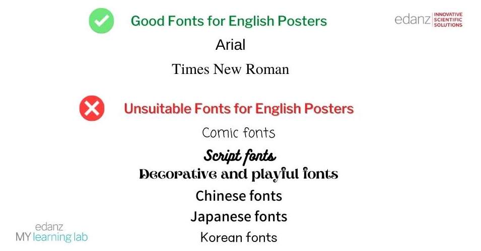
Do not write English text in an Asian font.
We see this all too often on papers and manuscripts. Asian fonts are designed with different spacing to accommodate wider characters. This gives English text a blocky, imbalanced, and unnatural feel. This can create discomfort and even lead to bias.
- For Chinese authors, avoid SimSum and others.
- Japanese authors – avoid MS Mincho, MS Gothic, and others.
- And Korean authors – don’t use Malgun.
Printing
Use matte paper and attach this to the board. Alternatively, you can even print on canvas or cloth for a classy effect. This also lets you fold it into a suitcase or roll it into a tube for easier transport.
Avoid silk because it can sag and warp. It’s not durable enough.
Above all, avoid glossy surfaces, because they can reflect the light. Then no one can read your poster. This includes lamination. It may protect your paper, but it only hurts the readability.

“Fabric posters are a great idea. Typically I use cotton. Spend a bit extra to get yours printed on fabric. It’s much more convenient than traveling with a poster tube and you’ll save yourself some sanity at the conference.”
— Jacqueline Tudball, PhD
Edanz Author Guidance Consultant
What should you NOT put on your presentation poster?
A viewer might only spend a minute or two looking at your poster, so they should be able to quickly sense of it and what you’re trying to say.
Big no-nos are:
- Too many images, tables, or graphs – use the main one with a brief explanation
- Text that’s too small to read – check if you can easily read the body from from 1 m away and the headline from at least 3 m away
- Too many references – just cite what’s important regarding the information in your poster
- Competing eye-catching images – one is enough
- A picture that doesn’t say anything; your images have to communicate a core message
- Light text on a dark background; it hurts the eyes
- Glossy covering, or printing on glossy paper
What software should you use to make a research poster?
Use software you’re comfortable with, or use this as an opportunity to lift your design skills. If you’re working with others on your poster, all the major software packages have cloud-based options. But some are clearly better than others.
And if you dream of being a design wizard but your actual skills have other ideas, most of the tools below offer handy poster templates to get you started.
PowerPoint
PowerPoint is also a very useful tool for making poster presentations. Set the page size before starting and add in your elements. You can either do this on a single slide or make each section a separate slide, then print and paste them to form your poster.
With the MS 365 suite, you can make your PowerPoint cloud-based so your whole research team can work on it no matter where they are. Just be aware that MS 365 still trails Google Workspace for ease of use. It’s hard to work on things at the same time on MS 365. The whole MS suite is also pay-to-use, unlike Google.
Here’s a terrific compilation of free PowerPoint poster templates.
Google Slides
Like Google Docs and Sheets are to MS Word and Excel, Google Slides is Google’s cloud-based version of PowerPoint. It’s cloud-based, so you your project will be PC- and place-independent, and your team can work on it collectively in real time. You can also import PowerPoint ppt/pptx files and they’ll generally convert with no problems at all.
Perhaps best of all, it’s free. And you’ll be compromising very little vs. PowerPoint. For the more design-talented, Adobe may be your best bet.
Adobe Illustrator
Adobe Illustrator is a long-standing program for both image manipulation and poster design. It’s now part of the Adobe Creative Cloud suite, which also includes Photoshop.
In Illustrator can set the page size for your poster beforehand and use templates to create a base.
As this software was design for a wide range of publishing functions, it’s easy to move things around. If you’re used to it and comfortable with it, use it. Just be aware that .ai files may not be compatible with other software. It’s also paid. So your whole team will need it and need to be comfortable with it if they’re going to be working on the poster design.
Adobe InDesign
Adobe InDesign has actually been around for over 20 years. But it’s taken a long time to gain a loyal following. Many professional designers now swear by it for its rich suite of options.
Especially for publications, when working with larger amounts of text, InDesign may be the best large-scale commercial software around.
Publishers and design agencies often use it in combination with Adobe InCopy, which the text-based roles such as copywriters and editors can use more easily and with less instruction.
You can find a handy PDF here on making posters in InDesign.
Canva
This a less-conventional choice but even design novices can turn out visually appealing designs on Canva.
While not near the complexity and power of the Adobe programs, Canva’s appeal is how very user-friendly it is, as well as its pre-baked features such as templates, color pallets, fonts, and a drag-and-drop interface.
Canva is free for basic use. A paid membership of about $10/month opens up a huge library of images and other options for you to use.
What not to use
Even if you’ve been using MS Word since you learned to read and write, it’s not the best choice for a poster presentation.
Can you do a poster presentation on Word? Sure.
Will be it easy to move objects to just where you want them, work with multimedia, adjust resolution and colors, and print out a clear and compelling poster? No, it won’t.
Word has a tendency for things to falls apart when the document structure gets too complex and with multiple elements.
It’s also designed foremost for handling text. Stick with tools like Word, MY manuscript, and Google Docs for writing your manuscripts and for increasing your publication rate. Then use one of the other recommendations above for designing your poster.
Whatever you use, print and adjust
Whatever software you use, print out your poster, pin it to the wall, and look at it from 5 or 6 meters away. It will look totally different than it did on your computer screen.
Adjust accordingly.
Examples of good posters
You’ll find different good elements in these examples.
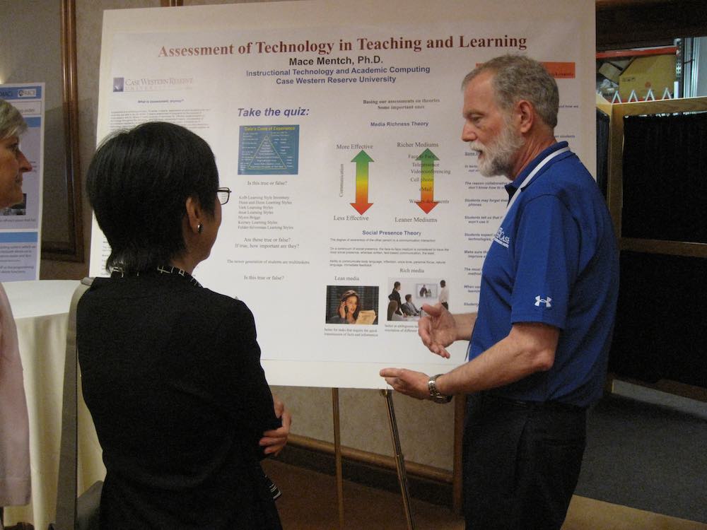
This first one is a straight and clean design, Times New Roman font, plenty of white space, three defined columns and a reasonable amount of text. It also has photos to balance out the simplistic charts.

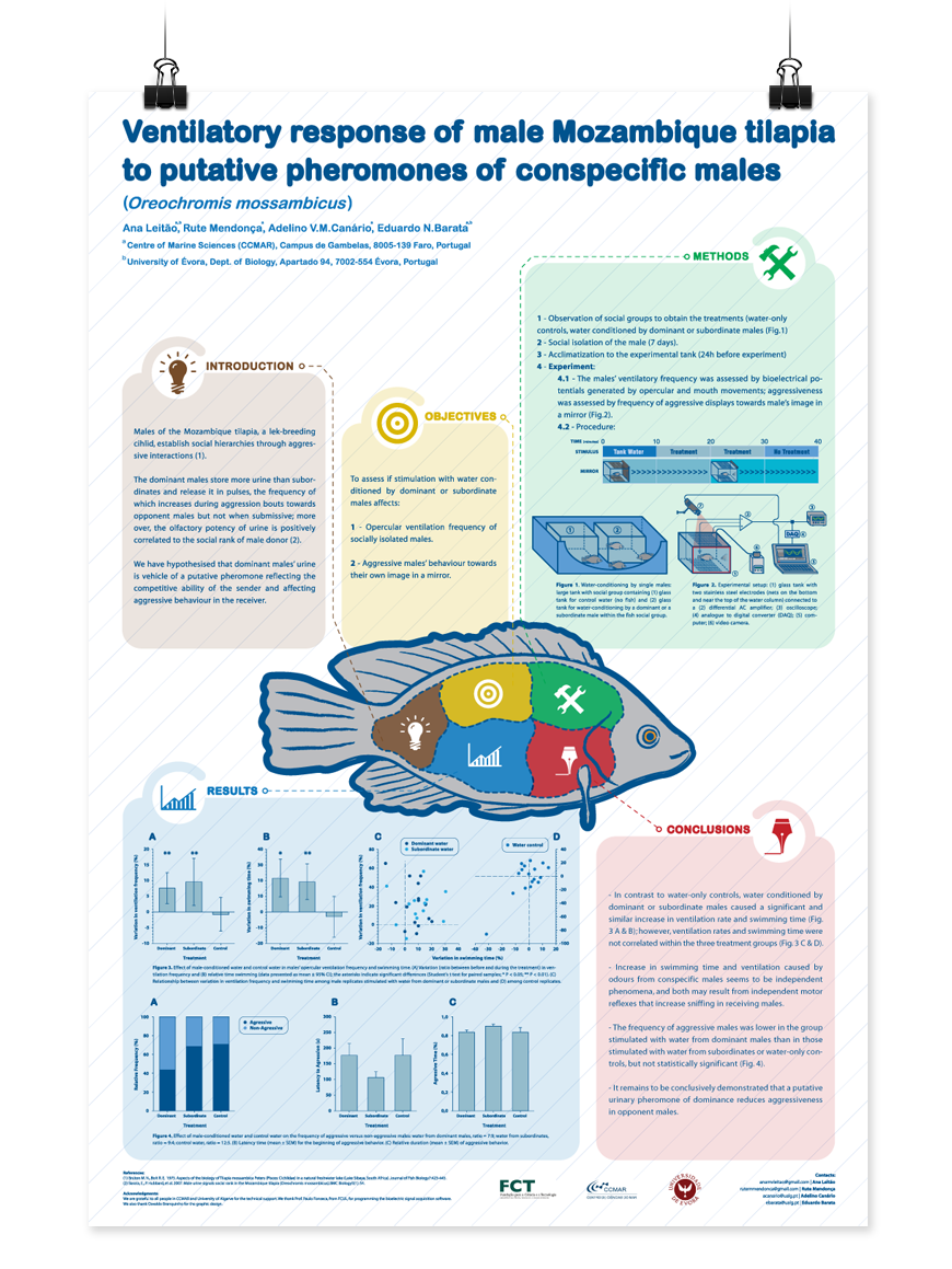
This next one really ups the game. The text sections are pastel blocks and contain ample text. There’s comfortable white space. But what really grabs you is that fish!
You’ll need to up your design game to match this one. Or simply hire a designer to make it pop.
Insider PhD tips on making winning research posters
Finally, some tips for your poster presentation, in no particular order.
- Before you start, check the conference info or ask the conference secretariat directly if there are guidelines.
- If want to communicate more info than you can put on the poster, print out A4- or letter-sized supplements and hand them out to people who are interested.
- Keep sponsors and names to a minimum. It’s about the science, first and foremost.
- Make sure all visual have a short legend to explain them.
- The background and text should have contrast, but watch out for color clashes. Google “color contrast checker” for ideas on good color combinations. Canva also offers many recommended pairings.
- Always take your own pins, tape, Velcro, etc.
Hope that helps. When you want to be sure your poster’s message is in superb scientific English, contact us for an edit.
To explore the publication process, including post-publication and publicizing your work, take an expert-designed course at the Edanz My Learning Lab.
RECOMMENDED COURSE:
How to Give a Poster Presentation ?

RECOMMENDED COURSE:
Presenting and Discussing Your Research